

A Closer Look: Parmigiani Fleurier Toric Perpetual Calendar
Reviews
A Closer Look: Parmigiani Fleurier Toric Perpetual Calendar
Summary
Parmigiani Fleurier is one of the few interesting brands that started small as an independent watchmaker and, through consistently excellent offerings, gradually attracted a following of enthusiasts who supported its rise to the scale of a recognised watchmaking brand. Yet it remains very much independent in how it operates.
More interestingly, Parmigiani is not just different from most watchmakers on the market. It seems almost indifferent to trends — not in terms of product category, but in its design language and style — with a clear focus on subtlety and restraint. Quiet luxury, in other words, is what Parmigiani is all about. The Toric Perpetual Calendar, the subject of today’s review, stands as a clear expression of that philosophy: luxurious minimalism at its finest.
Rethinking the Perpetual Calendar dial
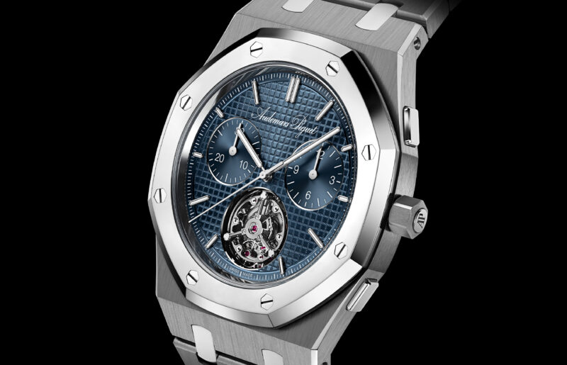
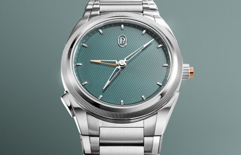
In recent years, Parmigiani’s focus on quiet luxury has become ever more evident, particularly in the revamped Tonda PF collection. As a luxury sports watch with an integrated bracelet, it stands apart from its rivals. Where many peers favour bold cases, elaborate dials, and conspicuous finishes, the Tonda PF opts for a more understated approach. Yet it is far from plain. Its refinement may not be instantly apparent to the casual eye, but it reveals itself gradually to the wearer.

Two beautiful compositions. (Image: Revolution ©)
And to my surprise, and very much to my satisfaction, this design philosophy comes together beautifully in Parmigiani Fleurier’s latest release earlier this year at Watches & Wonders: the all-new Toric Perpetual Calendar. It is clean, simple, and incredibly satisfying to just stare at.
For the longest time, perpetual calendars have always been associated with complex dials. As beautifully organised and rhythmic as they are, such as those of the revered mid-20th century Patek Philippe, they are still, at their core, densely packed with printed scales and tiny hands.
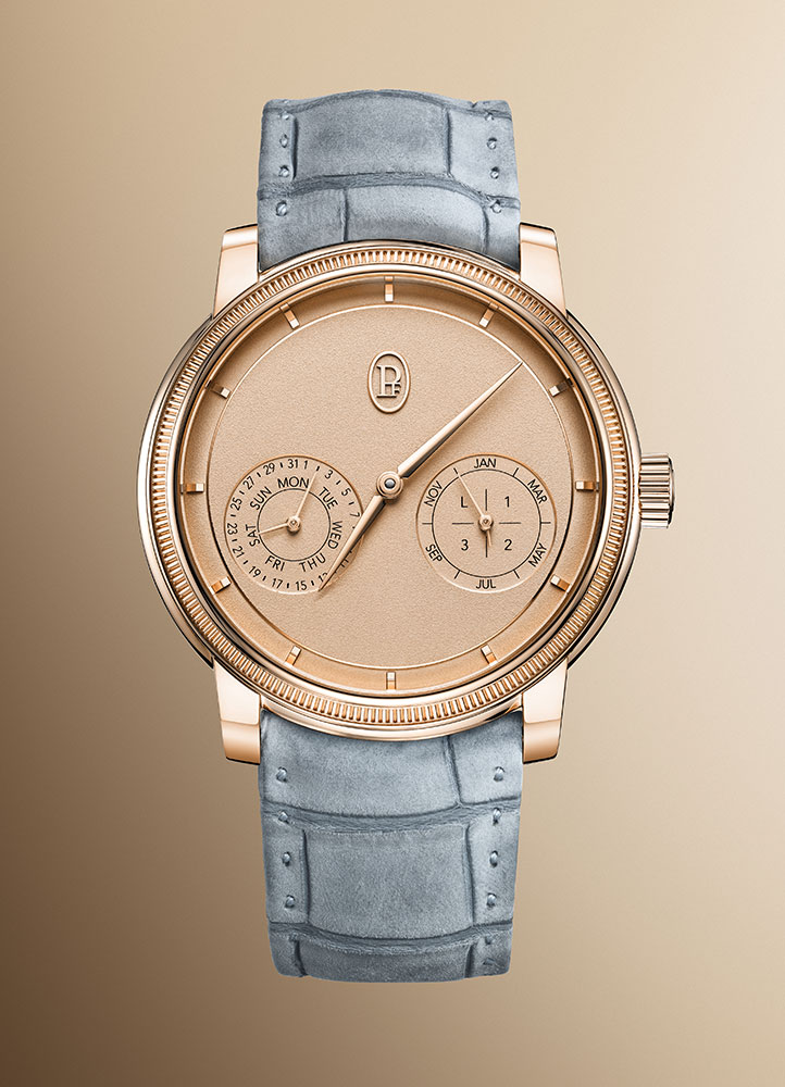
Pink on pink. (Image: Revolution ©)
In the past decade, however, independent brands have taken a completely opposite approach. They strip away as much as possible from the dial while still retaining all the information a perpetual calendar needs to show. That was the case with Ludwig Oechslin in his designs for Ulysse Nardin and later for his own brand, as well as with Andreas Strehler in his work for H. Moser & Cie — whose perpetual calendars put the brand on the map and are now regarded as perhaps the most minimalist perpetual calendar displays ever made.
But for collectors who already own both of these and are still looking for something that can truly surprise them, what is there left to discover?
Enter the Toric Perpetual Calendar.

Clean and legible. (Image: Revolution ©)
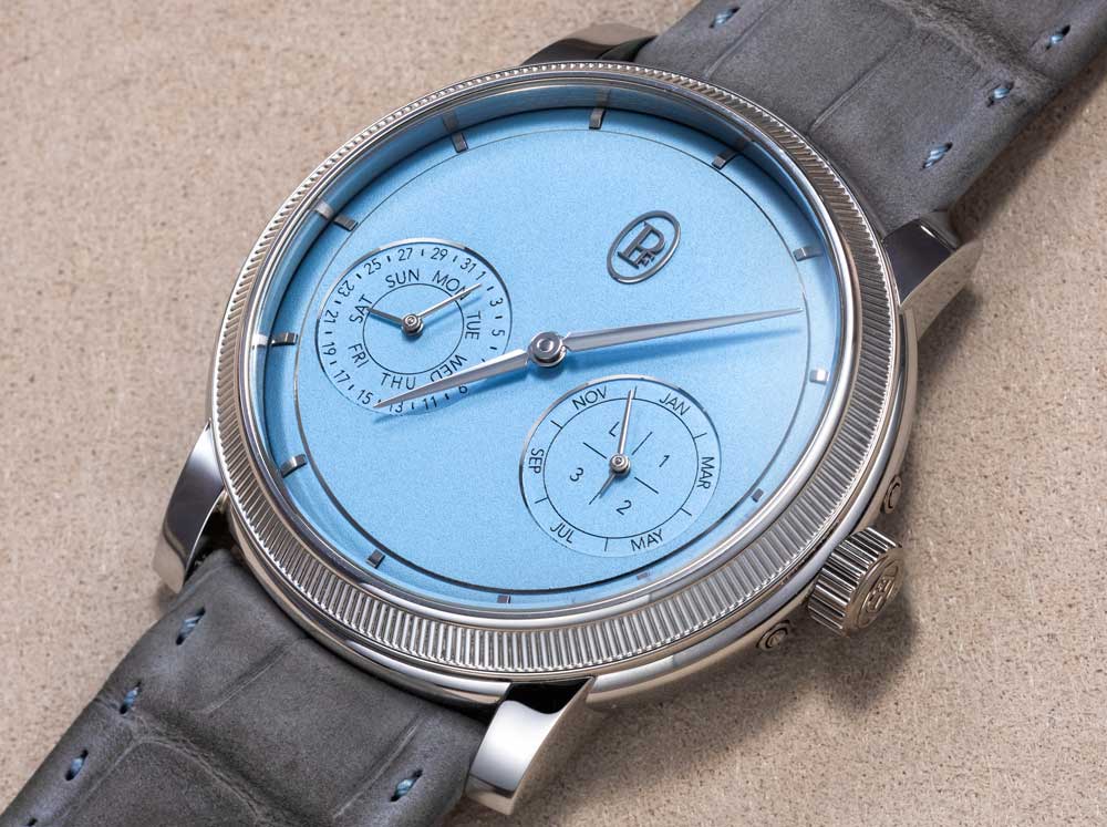
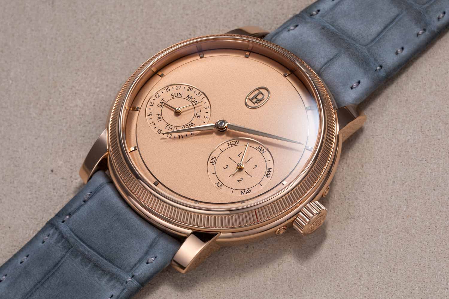
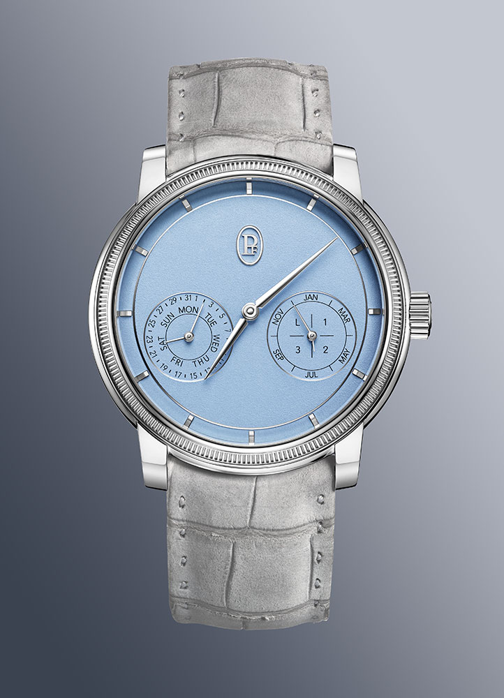
The Toric Perpetual does one thing really well. It does not try too hard to impress, which is entirely in line with the brand’s character. It avoids the traditional three or four sub-dial layout, and more interestingly, it also avoids trying too hard to be ultra-minimalist. Instead, it reduces clutter and keeps just two sub-dials, each with co-axial, double indicators. The result is something that feels extremely legible and informative at a glance.
Compared to Moser’s QP display, which requires flipping the watch back and front to see all the indicators, the Toric feels instantly much cleaner than a traditional perpetual calendar, while still being just as complete.

(Image: Revolution ©)
This is where a brand’s identity and philosophy really come through. When a brand has soul, it follows its own direction, does what it believes in, and executes it well. Parmigiani shows exactly that here.
Reading this watch is simple. There are only two counters, so it doesn’t overwhelm or confuse the visual senses. On the left counter, there is the day-date function. The shorter hand points to the day of the week, while the longer hand points to the date. On the counter on the right, you’ll find the month, along with a small indicator for the leap year.
There is no year display, and no running seconds either. But the presence of the day, date, month — and importantly, the leap year, which is key to how a perpetual calendar works feels more than sufficient. Or at least, it feels like a fair trade-off for how beautifully clean the dial looks.
Domed dial with subtle geometric depth
It’s funny to admit, but I often find myself staring at the watch not because of the beautiful twin counters, but because of the sparse landscape made possible by the fact that there are only two of them. Taking a step back to think about why, it becomes clear that it is actually a feat to make a simple dial look attractive. Most of the time, when a dial is left unfilled, the empty space can feel too bare, making the dial appear flat, wide, and frankly, boring.

The polished rings are not only accents, they also form the borders between two different levels, stepping up and down. (Image: Revolution ©)
That is clearly not the case here. So how does Parmigiani make a simple dial feel compelling? The short answer lies in the brand’s attention to detail. It creates subtleties in the presentation that are hard to explain with words but are immediately picked up by the eye. Human perception after all is remarkably sensitive, more so than even the best cameras.
To start with, the dial features a few thin, polished metallic rings that act as subtle highlights. These rings also break up the surface into smaller visual sections, which helps avoid the dial looking too wide or empty. You can see these rings around the twin counters and along the outer edge of the dial. There is also a thoughtful use of geometry. The logo and the two sub-dials form a triangle, creating a sense of balance and quiet structure. These are examples of design language that may sound clinical on paper, but when done properly, the beauty speaks for itself.

Gently sloping outwards. (Image: Revolution ©)
And when you step back from the details, the sparse landscape that first catches the eye still holds its appeal on its own. Even without analysing the design choices, the watch draws you in because the colour palette works so well, whether in “Morning Blue” with platinum or “Golden Hour” with rose gold. The light, powdery effect on the dial softens the tone and lends the whole composition a soothing charm.
But of course, these are details you can analyse from a picture alone. So what are the subtle touches I mentioned earlier that only become visible through ownership? One of them, in fact, is the domed dial. If you look closely, you will notice that the dial gently slopes down and outwards towards the edge. This is the complete opposite of the usual practice, where the rehaut or flange slopes inward towards the centre.
This domed effect adds a sense of three-dimensionality, which makes the watch feel more sculpted and visually interesting. Just as importantly, it makes the dial appear slightly smaller, since the slope gives the impression of it tapering outward. What really impressed me is that Parmigiani applied solid hour markers along this sloping edge. Normally, applied markers are only used on flat surfaces to avoid gaps between the base of the marker and the top of the dial. Here, the brand has clearly taken the more complex route, adjusting the geometry of the markers to match the curve of the dial. It’s the sort of detail that will quietly delight an owner the day they happen to notice it.
Excellent case design featuring layers and curves
Usually, for a dressy watch, a smaller case is preferred. But Parmigiani has managed to create a watch that feels both classical and contemporary, and that calls for a case with a bit more presence. Not too large, of course, which is why it strikes a balance at 40mm, a size that feels just right for the soul and character of the watch.

A simple case at a glance, yet handsome and solid in proportion. (Image: Revolution ©)
As expected from a high-end brand, the watch is relatively thin at just 10.9mm tall. That is partly thanks to the old-school movement inside, which is manual-winding rather than automatic. More importantly, though, is how much Parmigiani has managed to achieve within that slim profile. The case design is surprisingly nuanced.
To start, the bezel is actually triple-stepped, with two polished domed rings sandwiching a fluted, knurled middle. All of this is done in such a thin and subtle way that it almost looks like a simple bezel at first glance. But you cannot help but feel there is weight and personality in its restraint. This is where the brand shows its strength of packing detail into a subtle package.

The nuances in the case profile. (Image: Parmigiani Fleurier)
The case itself is also more complex than it first appears. It has twin slopes, one that acts like a shoulder expanding outward from the top, and another that narrows in as it flows downward like a tapering body. It almost resembles the silhouette of a teapot, with lines that widen at the top and then contract towards the base. The result, from a distance, is a case that looks simple. But up close, it reveals a level of subtle shaping that few brands bother to explore.
If this is not a definition of quiet luxury and thoughtful design, it is hard to find another example in the watch world that shows this much patience and this much confidence in the eye of its wearer.
Inside the manual-winding PF733 movement
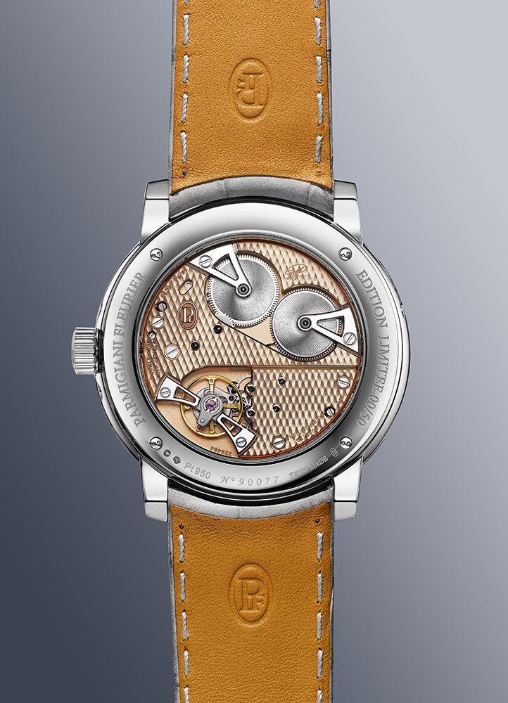
Turning the watch over is surprising, because the view isn’t what you’d typically expect. Perpetual calendar watches are usually paired with automatic movements, but here it’s manual-winding. But more intriguingly, the movement looks quite unlike most other hand-wound calibers on the market.

The PF733 is based on the PF780 introduced last year in the Toric Petite Seconde. (Image: Revolution ©)
The layout is distinctly old-school. In fact, it harks back to early pocket watches, where bridges were cut into simple geometric shapes with sharp lines and minimal outline. It’s a style seldom seen today, yet Parmigiani has chosen to give the Toric lineup a deliberate nod to the true classics.
There is, however, also a touch of modern detail, likely intended to add visual interest and keep the movement from appearing too bare. This is most evident in the cut-out for the twin barrels and the distinctive shape of the steel bridges that hold them.

The special Côtes de Fleurier finish. (Image: Revolution ©)
To keep the movement from looking too plain, the brand has applied a Côtes de Fleurier finish, a pattern of diamond-shaped sections, each further filled with fine criss-crossing stripes. It adds texture to the bridges, breaks up empty surfaces, and plays with the light in a way that makes it genuinely pleasing to look at.
As for the finishing, it is neatly executed to a solid standard typical of a big brand. The usual elements are present, including polished bevels, along with a few exterior angles and even some interior angles on the steel bridges for both the barrels and the balance wheel. In some areas, however, the finishing adopts a simpler form, foregoing exterior angles in favour of continuous bevels.

Interior angles within the balance bridge. (Image: Revolution ©)

More interior angles. (Image: Revolution ©)

(Image: Revolution ©)
Concluding thoughts
For a collector seeking something different from the typical perpetual calendar formula, and more importantly something that doesn’t try too hard to impress, the Fleurier Toric Perpetual Calendar fits the bill perfectly. It is original in its thinking, clever in its design, and beautiful in its execution.
Tech Specs: Parmigiani Fleurier Toric Perpetual Calendar
Reference: PFH952-2010002-300181 (platinum); PFH952-2010001-300181 (rose gold)
Movement: Manual-winding PF733; 60-hour power reserve
Functions: Hours and minutes; perpetual calendar
Case: 40.6mm × 10.9mm; platinum or 18K rose gold; water-resistant to 30m
Dial: Golden Hour or Morning Blue
Strap: Akoya Grey nubuck alligator leather
Limited edition: 50 pieces in each metal
Price: CHF 92,000 (platinum); CHF 85,000 (rose gold)
Parmigiani Fleurier

You may also like
News
The New Parmigiani Fleurier Tonda PF Sport Chronograph In Rose Gold Sandstone
Jul 17, 2025
News
The New Parmigiani Fleurier Tonda PF Sport Chronograph In Rose Gold Sandstone
Jul 17, 2025

News
Parmigiani Fleurier’s Tonda PF Chronograph Embraces A Soothing Hue In Mineral Blue Magic
Jun 30, 2025
News
Parmigiani Fleurier’s Tonda PF Chronograph Embraces A Soothing Hue In Mineral Blue Magic
Jun 30, 2025
Parmigiani Fleurier at Watches & Wonders 2025: Tonda PF GMT Rattrapante Verzasca
Apr 1, 2025
Parmigiani Fleurier at Watches & Wonders 2025: Tonda PF GMT Rattrapante Verzasca
Apr 1, 2025